Objective
To explore how Gestalt principles, a set of psychological concepts, can be applied to UI design to improve user experience. The goal was to redesign a health & fitness app’s user interface to make it more intuitive, improve visual hierarchy, and help users achieve their fitness goals with ease.
Background
A health & fitness startup had recently launched a mobile app aimed at helping users track their workouts, nutrition, and progress. While the app had a solid user base, feedback from users indicated that they found certain sections of the app difficult to navigate. Users also reported feeling overwhelmed by the large volume of data presented on the dashboard, which led to confusion when trying to track progress or start a workout.
The design team decided to apply Gestalt principles to simplify the app’s interface, improve user flow, and create a more cohesive visual experience. By leveraging these principles, the team aimed to make the app feel more intuitive and help users better engage with the app’s core features.
What is Gestalt in UI Design?
Gestalt principles are based on the idea that people perceive objects as organized patterns or wholes, rather than as individual components. These principles, originating from Gestalt psychology, are widely used in design to guide the visual flow of information and enhance user experience. The main principles include:
- Proximity: Objects that are close to each other are perceived as related.
- Similarity: Items that share visual characteristics are seen as part of a group.
- Closure: People tend to complete incomplete shapes or figures mentally.
- Continuity: Elements that are aligned or follow a continuous path are perceived as part of the same group.
- Figure-ground: The distinction between the foreground (main content) and the background (less important content).
- Symmetry: People perceive symmetrical elements as belonging together.
Challenges
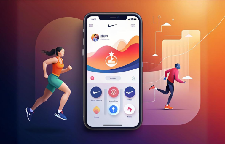
- Cluttered Dashboard: The home screen of the app displayed numerous statistics and workout data, which made it difficult for users to find the most important information at a glance.
- Confusing Navigation: Different sections of the app, such as workout routines, meal plans, and progress trackers, were not visually distinguished, leading to confusion about where users should go next.
- Lack of Visual Hierarchy: Important actions, such as starting a workout or viewing daily progress, were not prominent enough, making it easy for users to miss key features.
Approach: Applying Gestalt Principles to the Redesign
Step 1: Simplifying the Dashboard Using Proximity and Similarity
- Before: The dashboard showed all stats, including steps, calories, water intake, and workout progress, in scattered sections. There was no clear organization, making it hard for users to focus on what mattered most.
- After: Using Proximity and Similarity, we grouped related information together. For instance:
- Workout-related stats (e.g., calories burned, workout duration) were placed in a single cluster.
- Health metrics (e.g., steps, heart rate, water intake) were grouped separately.
- Result: By using proximity, users could more easily interpret related information as belonging together. This increased clarity and helped users focus on key data without feeling overwhelmed.
Step 2: Enhancing Visual Flow with Continuity
- Before: Different sections of the app felt disconnected, and users found it challenging to quickly navigate from one section to another.
- After: Using Continuity, the design was adjusted to create a natural visual flow between sections. For example:
- The action buttons (like “Start Workout” or “Track Progress”) were aligned in a horizontal row, guiding users’ eyes naturally from left to right.
- A continuous timeline of daily progress was introduced, helping users move seamlessly from one milestone to the next.
- Result: The improved visual flow made it easier for users to navigate the app, moving from one task to another without confusion.
Step 3: Creating a Clear Figure-Ground Relationship
- Before: The app’s design had little distinction between key content and secondary elements, which made it hard for users to focus on what mattered most.
- After: The Figure-Ground principle was applied to establish a strong contrast between the main content (e.g., current workout, progress) and secondary information (e.g., tips, ads). This was achieved by:
- Using background shading or cards to set secondary content apart from primary actions.
- Bright colors were used for key actions (like buttons), while muted tones were used for less critical content.
- Result: The clear distinction between foreground and background allowed users to quickly identify and engage with the most important parts of the app, such as starting a workout or viewing their progress.
Step 4: Fostering Closure with Card-Based Design
- Before: The app displayed workout data and progress in disconnected formats, leading users to feel as though they couldn’t “complete” the tasks.
- After: The Closure principle was employed by introducing a card-based design where each section (workouts, progress, nutrition) was enclosed within visually distinct cards. Each card acted as a closed unit that the user could interact with.
- For instance, clicking on the workout card revealed workout routines, and clicking on the progress card showed detailed metrics.
- Result: Users felt a sense of completion and control when interacting with distinct cards, increasing engagement with the app and making navigation more intuitive.
Step 5: Enhancing Symmetry for Consistent Layouts
- Before: The layout felt inconsistent, with buttons, stats, and text placed unevenly across the screen.
- After: Symmetry was applied by ensuring that elements aligned symmetrically across the page. For example:
- The dashboard’s primary call-to-action buttons (e.g., “Start Workout”) were placed symmetrically with the progress stats, so that key elements were balanced and aligned in a predictable way.
- Consistent padding and spacing were maintained across different sections.
- Result: The symmetrical layout created a sense of order and harmony, leading to a more aesthetically pleasing and organized interface.
Outcomes
Business Metrics:
- Conversion Rate: The conversion rate of users starting their first workout increased by 30%, as the improved visual hierarchy made the “Start Workout” button much more prominent.
- User Retention: Retention rate improved by 20%, driven by the more intuitive and engaging interface.
- In-app purchases: There was a 15% increase in users upgrading to premium features, as the layout made the value of these features more apparent.
UX Metrics:
- Task Success Rate: The success rate for users completing tasks (e.g., starting a workout, logging food) increased by 25%.
- User Satisfaction (CSAT): The user satisfaction score rose from 70% to 85%, with positive feedback focused on the clarity and ease of navigation.
- Time to Task Completion: The time it took for users to start a workout and track progress decreased by 18%.
Key Insights
- Gestalt Principles Improve User Focus: Applying Proximity and Similarity helped group related information, improving users’ ability to focus on what was important and reducing cognitive overload.
- Visual Continuity Guides User Flow: Creating a continuous visual flow made the app feel more intuitive, helping users naturally progress from one task to the next without confusion.
- Clear Figure-Ground Contrast Enhances Prioritization: By using strong contrast to distinguish primary and secondary content, users could more easily identify key actions, leading to improved task completion.
- Closure Creates a Sense of Control: Card-based design elements fostered a feeling of closure, making tasks feel more complete and helping users engage more deeply with the app.
- Symmetry Brings Visual Harmony: Symmetry in the layout made the interface feel more organized and less chaotic, which in turn led to a more enjoyable and efficient user experience.
Conclusion
By leveraging Gestalt principles in the redesign of the health & fitness app, the team was able to create a more intuitive, visually cohesive, and user-friendly experience. Applying principles like Proximity, Similarity, Continuity, and Figure-Ground significantly improved the app’s usability, leading to higher engagement, better task completion rates, and increased user satisfaction.
Key Takeaway: Gestalt principles are not just theoretical ideas—they have practical applications in UI design that can dramatically improve user experience by helping users better perceive and interact with the content. By applying these principles to create a more intuitive design, users can achieve their goals with greater ease and satisfaction.