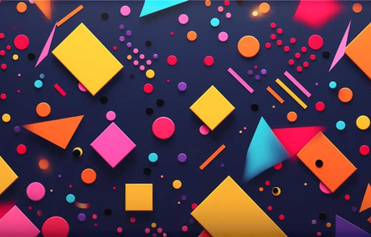
Design is more than just aesthetics—it’s about understanding human psychology and using it to create experiences that guide users toward specific actions. Colors and shapes, fundamental elements of design, have a profound impact on user behavior and decision-making. By understanding the psychology behind these elements, designers can create interfaces that are not only visually appealing but also effective at achieving their intended purpose.
In this blog, we’ll explore how colors and shapes influence user decisions and how you can apply this knowledge to your designs.
The Psychology of Colors
Colors are powerful psychological tools that evoke emotions, influence perceptions, and drive actions. Different colors have distinct associations and effects on users, often rooted in culture, biology, and personal experiences.
Common Color Associations
- Red:
- Emotions: Energy, urgency, passion
- Applications: Often used for CTAs (Call-to-Actions) like “Buy Now” or “Sign Up” buttons to create a sense of urgency or importance.
- Blue:
- Emotions: Trust, calmness, reliability
- Applications: Popular in corporate websites, financial services, and healthcare, where trust and stability are key.
- Green:
- Emotions: Growth, health, environmental friendliness
- Applications: Used in eco-friendly brands, health apps, or to signify success (e.g., “Success” messages).
- Yellow:
- Emotions: Optimism, creativity, caution
- Applications: Often used to grab attention but sparingly, as excessive yellow can cause anxiety.
- Black:
- Emotions: Sophistication, luxury, power
- Applications: Used in high-end brands or minimalist designs to convey elegance and exclusivity.
- White:
- Emotions: Simplicity, purity, clarity
- Applications: Commonly used in clean and modern UI designs to enhance readability and focus.
Practical Tips for Using Colors in Design
- Establish Visual Hierarchy: Use contrasting colors to draw attention to key elements, like buttons or important information.
- Maintain Brand Consistency: Align color choices with your brand identity to create a cohesive experience.
- Consider Accessibility: Ensure sufficient color contrast for readability and usability, especially for visually impaired users.
- Cultural Sensitivity: Be aware of how colors may be perceived differently across cultures.
The Psychology of Shapes
Shapes also play a significant role in influencing user perceptions and decisions. They communicate subconscious messages and guide user behavior based on their form and structure.
Common Shape Associations
- Circles:
- Meaning: Unity, wholeness, community
- Applications: Frequently used for profile pictures, badges, or buttons to create a sense of inclusiveness and friendliness.
- Squares and Rectangles:
- Meaning: Stability, reliability, order
- Applications: Commonly used in layouts, grids, and cards to convey structure and organization.
- Triangles:
- Meaning: Direction, movement, risk
- Applications: Used in navigation (e.g., arrows) or to create a sense of progression or urgency.
- Rounded Edges:
- Meaning: Approachability, friendliness
- Applications: Frequently used in modern UIs to soften the overall feel and make designs more user-friendly.
- Sharp Edges:
- Meaning: Strength, precision
- Applications: Often used in industries like technology or manufacturing to convey a cutting-edge or professional feel.
Practical Tips for Using Shapes in Design
- Guide User Focus: Use arrows or directional shapes to lead users’ eyes toward key elements.
- Create Balance: Combine shapes strategically to achieve a harmonious and visually appealing layout.
- Align with Branding: Choose shapes that reflect your brand’s values and personality.
- Enhance Interactivity: Use dynamic shapes like progress bars or sliders to engage users.
Combining Colors and Shapes for Maximum Impact
Colors and shapes work best when used together to create a cohesive and intuitive design. Here’s how:
- Call-to-Actions (CTAs):
- Use contrasting colors (e.g., red or green) on rounded buttons to draw attention and invite interaction.
- Incorporate subtle animations or hover effects to make CTAs more engaging.
- Visual Hierarchy:
- Combine bold shapes (e.g., rectangles or cards) with vibrant colors to highlight important information or sections.
- Use muted tones for less critical content to avoid overwhelming the user.
- Onboarding and Navigation:
- Use directional shapes like arrows in tandem with a calming color palette to guide users through tasks.
- Brand Personality:
- Reflect your brand identity by pairing specific shapes with consistent color themes (e.g., a tech brand might use sharp edges with a blue and white palette for professionalism).
Real-Life Examples of Effective Design Psychology
- Spotify:
- Spotify uses a vibrant green paired with rounded buttons to convey positivity and invite users to interact seamlessly with the platform.
- Google:
- Google’s simple and clean design leverages circles (e.g., icons) and a predominantly white palette to evoke clarity and focus.
- Airbnb:
- Airbnb’s use of soft pinks and rounded edges creates a sense of warmth and community, aligning with its brand mission.
Final Thoughts
Design psychology is an invaluable tool for creating user experiences that resonate emotionally and function effectively. By understanding how colors and shapes influence user decisions, designers can craft interfaces that not only look good but also drive meaningful action.
The next time you design a product, remember: every color and shape you choose tells a story. Use them wisely to create experiences that are not just aesthetically pleasing but also deeply impactful.